I am currently studying Art History with the Open University. Actually to be more specific,  it is Art of the Twentieth Century. It focuses mainly on art from the last hundred years but the content is rich enough to sustain me within that time period alone.

This week the AQA examining board decided to cull A-Level Art History. I found out from a post in my Facebook feed. As with most news items in my Facebook feed, ‘This isn’t true’  was my first reaction. But no its not and here is why its my idea of a disaster.

All day I go and I sit at my desk in an administration job. I like my job and the people I work with make the day seem worthwhile.However if I did not have that art historical knowledge to devour on a regular basis, to be transported back in time socially, politically and  economically through the medium of art then I would struggle with the routine and the monotony. It is not in my nature but yet I am forced to comply because that is the nature of the professional system we have constructed. Studying art history serves my imagination, it serves my curiosity, and my creativity and ultimately it saves me from losing my mind.

I consider myself to be creative but lack confidence and often feel frustrated when I feel my insecurities stifle what I want, can and should create. Art history can be inspiring, the more knowledge you have of  arts history the more it can be used to further your own creative endeavors. Techniques, materials, concepts in contemporary art can inspire you to think about the ways in which you can create. This is enough to save it in schools, start the learning early and save the frustration that may come later.

This is why art history matters to me.I am not in school and there is no sign of a degree level cull of Art History (yet…) but I know the importance it holds if you do not fit into the conventional mold.  The routine of a steady job, feeling tired in that weird unsatisfying way that you sometimes feel after a long day at work, that drifts away when I study or when I feel creative. When I can immerse myself into another way of thinking, that is cathartic to me.

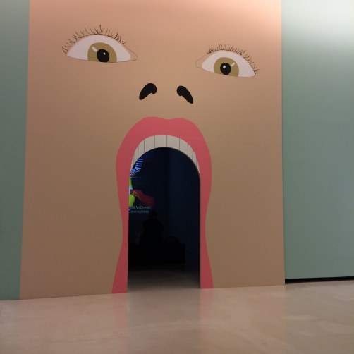
Artist Cornelia Parker OBE wrote in an article for The Guardian ‘…I studied art history.Having never had the chance to visit art galleries, I devoured the knowledge and it has served me well as a practicing artist’. What better way to foster creativity than to teach of those that were creative! Ken Robinson, an educational adviser has been writing and giving TED talks on how creativity is not prioritised in schools for years now. He talks about the ways in which creative subjects can foster employable skills and should not be as readily dismissed as they are. The damning of Art History as a ‘soft’ subject is another testament to this under appreciation of arts subjects. This does not set a satisfying precedent for the future.

I have signed the petition below and I hope that you do too…

https://you.38degrees.org.uk/petitions/save-art-history-as-an-a-level-subject


The Leeds International Film Festival guide was launched last week revealing Susan Steinbergs film Mirrors to Windows: The Artist as Women on the programme at The Leeds Town Hall.The documentary follows 10 female artists, three generations all working within differing mediums. The documentary tracks the evolution of these female artists both within their professional lives and how it intertwines with their personal lives.

Arists as women that are featured are Maliheh Afnan, Alice Anderson, Helaine Blumenfeld OBE, Jodie Carey, Susan Collins, Nermine Hamman, Charlotte Hodes, Sarah Lederman, Almuth Tebbenhoff and Rose Wylie RA. From differing countries that range from Cairo to France, from the United States to the United Kingdom.

The screen for the Leeds International Film Festival also includes a Q&A with the director.

http://www.leedsfilm.com/films/mirrors-to-windows-the-artist-as-woman/

http://www.latundra.com/mirrorstowindows_susansteinberg/

On a recent trip to Bilbao I managed to catch Jeremy Dellers ‘ The Infinitely Variable Ideal of the Popular’ at the Azkuna Zentroa after a friend messaged to tell me about the exhibition  after seeing I was in Bilbao from various smug Facebook updates. I was excited to go the Azkuna Zentroa, both as a tourist and to see the Deller exhibition.

The former wine warehouse has been transformed into a modernist cultural hub complete with a three floor library and a roof top swimming pool with a transparent floor so that the swimmers can be seen from the entrance in the main hall. The ‘Atrium of the Cultures’ forms the entry point to the spacious and airy building and houses 43 columns of different architectural styles in a variation of different materials designed by the French designer Phillipe Starck.

Jeremy Dellers exhibition was on -2 floor; two floors underground. As I approached the exhibition I was greeted by a giant doorway resembling a cartoonish mouth.I was reminded of the playful-ness of his 2012 touring inflatable Stonehenge: Sacrilege and it set the tone for the rest of the exhibition. Archival footage of Dellers previous projects including a delightful but thought provoking case study on German citizens buying their own piece of land and the diaries they kept of their time spent in these retreats. I was charmed and I did find myself pondering on the human need to have some space to call our own, somewhere to personalise and retreat.

img_64351

A second door titled  ‘LOCAL ARTIST’ led to a set up of a bedroom, toilet and living room. This was a re-creation of an exhibition that the artist held at his parents house when they were away from home. The blurb refers to his time living with his parents fresh out of art school, skint, but with a desire to exhibit.He decided to stage a  house viewing to ‘turn the slightly embarrassing situation of still living with my mum and dad in my mid-20s into a feature’. It was fun, with drawers to pull out with satirical references to popular culture and politics. It seemed meaningless, a product of the zeitgeist of the time but also meaningful because we all have our causes to follow, as a necessary part of being human.This was exemplified by a smiley face poster with the words ‘ DID HE CHANGE YOUR LIFE?’ in a wardrobe.

Following the gallery’s trajectory I passed his video of a brass band playing Acid House and then came into a much bigger hall. This was an unexpected amount of space that I did not envisage being beneath the Azkuna Zentroa. His satirical posters and his I (heart) Melancholy mural were exhibited.The mural is all the more imposing because of the space and starkness of the room. This mural is an ironic reaction to the ‘I Love…’ motif from the 90s. There is a sofa for visitors to relax beneath the mural to encourage interaction with the idea behind this piece. The mural celebrates the anti to the club culture of the 90s, to celebrate the need to be introverted and reflective.

img_6438

This exhibition was similar to a retrospective predominantly showcasing his early works . His love of music, popular culture and politics are light-heartedly satirised throughout but as with all satire there are important messages behind each piece. It appears more as a homage to different cultures and different time periods, specifically the interests of the young artist.

Richard Serra’s permanent exhibition ‘The Matter of Time’ at The Guggenheim Bilbao was also a highlight of my trip to Bilbao. The minimalist artist managed to dizzy and disorientate with his large scale undulating steel sculptures that are perhaps a nod to Bilbao’s history as a steel and iron exporter. The Guggenheim building was breathtaking upon the Bilbao skyline of which we viewed from the top of Artxanda mountain by funicular!

img_65231


http://www.jeremydeller.org/

http://www.azkunazentroa.com/az/cast/inicio

https://www.guggenheim-bilbao.es/en/


Its the 14th Frieze Fair in London and this year features Portia Munsons Pink Project. Her installation consists of mass produced found kitsch such as hairbrushes, dolls and even sex toys, all arranged methodically on a tabletop. I haven’t seen this in the flesh but from the photographs it looks both insanely attractive and instantly repulsive. I am drawn to it but my eyes hurt.

pinkproject

Photograph: Felix Clay for the Guardian

The Pink Project is intended to question the continual marketing of the colour pink on young girls and the commercial idea that femininity can be best represented by the colour pink.

ppow-frieze-1024x684

Photograph by Linda Nylind.


paula-chambers

The Bowery café in Headingley, Leeds is my favourite little place for having a coffee and a read. Not only does it sell trinkets, cards and stationery made by local craft makers it also has an upstairs gallery space that promotes the work of local artists. The Bowery also runs courses and workshops on a myriad of creative tendencies from Writing to Re-upholstery.

I frequently stop by the Bowery as it is near my house and on this occasion I thought I would pop in to the Gallery upstairs not knowing who was exhibiting but enjoying  having art at my convenience.

Paula Chambers was the artist exhibiting  on this day and continues to exhibit until 21st October. She is a Leeds College of Art lecturer who studied under feminist stalwart Griselda Pollock . She creates work that typically deals with gender stereotypes and the dilemma of what it means to inhabit the female body.

Her exhibition ‘Domestic Front’ at The Bowery uses readymade and found objects to create a sculpture. Flowery bins, pictures of flowers, ironing boards and sewing machine cases, referred to as ‘ feminine clutter’ form a barricade. This term is constructed by the idea of gender archetypes of masculine and feminine. Under these stereotypes these items define what it means to be female in the household. The barricade hits you as you enter the room blocking you from the majority of the room giving the illusion of another world behind the sculpture. There are paper and plywood cut outs of different females, some supermodel-esque, some housewives and even some children, all holding guns. This  computer manipulated imagery alludes to that of guerrilla insurgents in a space fiercely protected.

I don’t know if it was the sunlight pouring into the room that aided feelings of nostalgia  but it reminded me of  childhood memories of den-making, creating your own space and nesting away from the world. This was closely connected to being at home with my mother and thinking of the little nest that she created for us whilst my dad was working away.  I am not sure that this would have been the intended reading of the artists work  but it made me think about the impact of these stereotypes on the way my mother lived her life.

http://www.thebowery.org/


One of my new obsessions is the Lump Nubbin. These paper pulp sculptures are the work of artist duo Chiaozza. Artists Adam Frezza and Terri Chiao use torn and shredded old bank statements and newspaper, pulping them through a screen or with their hands. They then carefully transform them into a nubbin using plaster, brightly coloured paint and other mixed media.

Nubbin-of-the-Month-Club_BigCartel_556


Traveling-Giro_1200px_1000 Sprouting-Leg-Lump_1000

They also have a a series called the ‘The Whitney Lump Nubbins’ that are inspired by Agnes Martin, Arshile Gorky, Anne Truitt and other famous artists.

Gorky-s-Cup_1000

‘Gorky`s Cup’


And you can buy them! One day I hope to be surrounded by them like a crazy Lump Nubbins lady.

The duo focus their work on play and craft making. Its working because I feel utterly inspired to go forth and play with recycled materials and brightly coloured paints.

To see more of their work follow the link below.

http://www.eternitystew.com/

Instagram

@chiaozza

The Liverpool Biennial  has launched an initiative with Independent Curators International and CACTUS to support artists based in the North of England. With an £250,000 investment from the Arts Council International Showcasing Fund,  the objective of this initiative is to broaden industry contacts of artists working  outside of the London hub and to foster their careers both nationally and internationally using the reputation of the biennial as a springboard. This is good news for the ten artists shortlisted from 40 nominees who will go on to establish contacts with other biennials, curators, galleries and art fairs in addition to mentor ship and showcasing opportunities in the presentation of their work at The Liverpool Biennial.

One such artist is Mancunian Fine Arts graduate Nina Chua. Working with a ruler and pen on paper the artist creates drawings that often resemble  pieces of fabric. Repetition of lines are built up, line upon line, to create a neat supportive structure.These minimalist drawings highlight the symbiotic relationship between the process of creating and the final image. To me they appear ordered rendering them tranquil and stress free with no extraneous information.

Also looking forward to Andreas Angelidakis Collider structure in the Cains Brewery building, inspired by the Large Hydron Collider.

http://www.ninachua.com/

Read the rest of this entry »

I (POLY), 2016 25 x 25 cm, Acryl auf C-Print I (POLY), 2016 25 x 25 cm, acrylic on C-print

via I (POLY) — Michael Ehrhardt

Landscape and nude drawings come to mind with this print. The overall effect is one of perplexing and fascinating dynamism by artist Michael Ehrhardt.

I have long been a follower of art blogs and this is where I came across my new favourite, on a site such as Booooooom or something similar. I love them all equally, they merge into one and that is most certainly why I have forgotten.

Megham Howland is  an artist from Massachutsetts, now based in Portland, she predominantly works with oil on canvas. Her paintings feature human subjects, their faces and bodies obscured by birds, flowers or balloons. Her paintings embody a certain theatricality, a window into an imagined but almost probable world. A recurring theme in her 2011 paintings, subjects faces and bodies are  immersed by a flock of homogeneous birds.There is a playfulness to the images, they are often beautiful but subsequent years have seen her paintings become increasingly sinister.

meghanhowland2011

For instance, in her 2011 series of paintings (see above) , the birds were often embracing the human subject, there was a quietness, a tranquillity to the paintings , like the birds and human subject were in a harmonious relationship with each other. However one of my favourite paintings from 2012, is of what appears to be a small blonde boy, his face completely obscured by a small flurry of birds. The properties  are muted colours for dress and surroundings and the childs hair is blonde. The birds are black with a streak of red on their fur which serves as an aggressive contrast. There is a Hitchcockian aesthetic to the image, although admittedly this could be simply down to a connection made by myself of the auteurs more renowned film, The Birds.

Image

2012

One of my favorite paintings is a 2010 portrait of a close up of what appears to be a porcelain doll.It is a striking image and part of a series of paintings concentrating on the images of dolls. It is the only time she deviated from human subjects.

Meghan Howland  has claimed that ” I think the most important thing about my art, to me, is its way of communicating without too many words or explanations”. Paintings are open for interpretation.

See for yourself…

http://www.meghanhowland.com/

On Thursday the Art Everywhere project was launched. This is a two week endeavour to fill bus stops, billboards and shopping centres around the UK with 57 artworks, as voted by the public. The man behind the Innocent drinks company, the Tate and the Art Fund have teamed up to bring these works into the public domain. Originally there was to be 50 artworks selected but after an overwhelming response, some of the pieces drew ties in the public vote and the number increased.

arteverywhere

The original longlist was selected by curators, artists and experts  and then condensed by public vote. Within the 22,000 posters that will be pasted from the far reaches of Devon up to outer Scotland for all to enjoy, contemplate and possibly just ignore, there are some incredibly well known images. These works are incredibly influential relics from the different periods of art history.  Whilst most of the images selected are relatively well known works of art or paintings  there are also some exciting lesser known works that made the cut.

From the top ten works that were voted for, there was only one women chosen who still lives to see this delightful project. The incredible Cornelia Parker with An Exploded View. A re-imagined still from an actual pre-meditated explosion of the artists shed. And possibly, in my humble opinion,  the most exciting image to be replicated on posters throughout the country.


Pre-Raphaelite paintings of tragic women in literature such as John Everett Millais`Ophelia and John William Waterhouse paintings  Lady of Shallot (one of two Waterhouse to make the shortlist) to Patrick Caulfields multi-media iamgery. St Ives protegee` Alfred Wallis’ Five Ships, Mount Bay, to  Damien Hirst`s spots and sculpture by Barbara Hepworth. There is certainly a diversity in style, technique and a strong representation from all eras and mediums. I am supportive of the project as a way to bring art into focus, making it more accessible and just for no other alternative agenda than to inject some creativity into the daily routine of the masses.

Caulfield-701x800

The presence of  Francis Bacons disturbing Head VI on a gigantic billboard in the midst of  a shopping centre is enough reason to love this project.